No Zebra ApS for Nordisk Company A/S
Creating a redesign concept for Nordisk.eu.
UI design, animations
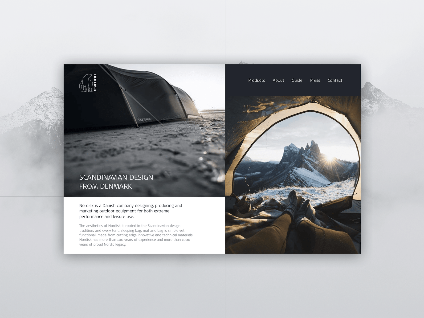
One of the core values of Nordisk is the focus on true Scandinavian design: clean, simple, and minimal.
Nordisk guarantees the quality of all of their materials that are technically innovative and continuously tested and improved.
The 100-year of history of delivering trustworthy quality represent professionalism that has to reflect in their website design.
The layout is kept structured and minimalistic, the usage of smooth and subtle interactions reflect quality, professionalism, and taste. The animations are not too noisy, but rather focused on details.
Product page is thorough and technical with 360 view, outlined illustrations, video etc but all the information is shown on 3 scrollable pages step by step: progressive disclosure. Some of the longer text collapses while scrolling, so that the content stays comprehensible and gives an easy overview. Ends with a clear CTA.
Large imagery that makes you feel a part of the experience. Usage of cinemagraphs and animations on images takes a step further, grabs attention and thus gives a more authentic feeling of being in the nature.